In order to talk about the concept it was important to look at the connections at the site. Firstly we needed to find the right size and volume for our building. In the scheme we show our process of thinking, we started out with showing the borders and the maximum space we could use. The maximum for us, was defined by borders of the square in the floorplan and by the height of the cathedral size wise. Then we started to cut the volume down slowly to find the right position and size. We lowered the maximum height considering we do not want to make competition to the majesty of cathedral, we want to preserve the monumental feeling. Next we cut the volume in size from the west side of the square since we wanted to leave some free space infront of the apsid not to change its look and perceiving. Reason to cut the volume from the east came up when we looked through historical plans and analysed them. We could clearly see, that the big open space on front of the apsid is quite new, and there was always block of buildings leaving only small square area for the market. We choose to follow this axis and leave the market square empty. In the end we cut the volume to the final form to a narrow rectangle, to preserve the free space in front of the cathedral and also to preserve the relationships between streets. This way we can add value to both squares.
When working with such historic area, we needed to agree on our opinion how to work with it and in it. One thing we realised was, that heritage area is very untouchable for us. We do not want to change it. It was quite interesting thought for us, that there is a metaphore in how similar this is comparing with nature. Both worlds very untouchable and beautiful.
We were very interested in this topic, and looking for inspiration, we found a very special kind of art. The best known artist in this kind of art is Richard Serra. The concept of his art is to put large scale statues into spaces in order to change the perceiving of the space.
Then we thought about how can we use this concept in urban space. We found multiple references of small or big objects used in the urban space to change its perceiving and atmosphere.

We thought about how we can implement this into the square. The idea started with what happens if we put for example a wall in the middle of the square. How does it change the perceibing of the square and space. With a simple scheme we show, that the difference between perceiving before and after putting the wall is huge. Especially talking about the cathedral, which is the main point of interest when looking at the square. Suddenly the cathedral can not be seen copletly and clearly and you wonder, what is behind the wall? also the small opening changes the flow of the square, people have to go around or as a mass through the opening. A very small structure/object changing the perceiving of a very well known scene largly.

So the remaining question was, how can we do this with our volume? To apply the concept, but use our building as the object. Clearly the volume was too big. It would change the place too much which was not our goal. We put the building underground, which reduces the volume and use small parts of the building peeking throught the surface. The parts visible will act as our statues to change the perceiving of the space. Visible parts are skylights bringing the light to the gallery and they leave a small footprints and hints of our building on the surface.
When looking at the sections, there is a connection between the square and the underground building made by skylights. The two areas overlap by changing level of the ground. The entrance we located from the courtyard of the Toullouse-Lautrec museum to preserve the connection with museum since it is an extension. It provides easy access from one exhibition building to another.
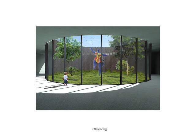
In the cross section it is shown that we create a different atmosphere in the gallery space. Last time we talked about the difference between the atmospheres inside the cathedral and outside at the square. Now we created another atmosphere, in our eyes somehow similar to the cathedral atmosphere. They share this kind of sacre quite atmosphere.
When thinking about the functions and programme of the building, we needed to find the relationships between each of the spaces. In this scheme we show what the relationships look like to us, how they connect.
We started to think about the order of the functions and how to make the layout in the building. In order to find the right layout we put the functions next to each other and looked at the proportions they represent. Next we prosposed multiple options of the combinations, but we agreed the final option will be chosen individually in further process.


